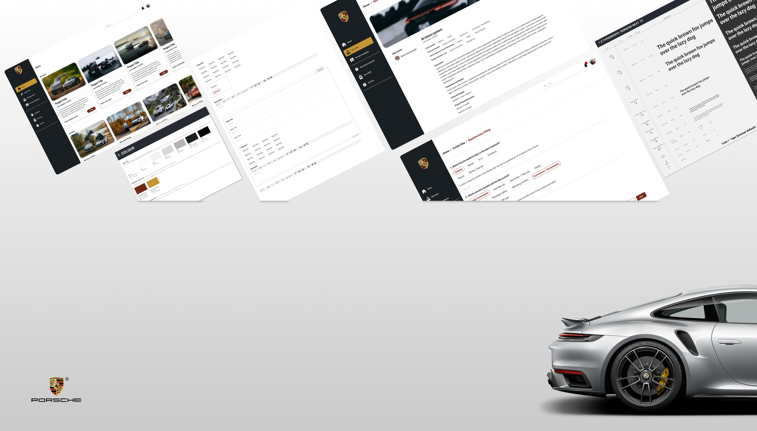
Implementing a voting system at Porsche
This project is a collaboration between CODE University and Porsche, initiated in 2020.
The project aims to establish a user-friendly digital platform for Porsche's pre-developers to create, share, and evaluate ideas. A minimum viable product (MVP) was developed and tested, enabling users to submit ideas and vote on them. I join the team after this process, my role was to design the final version.
Here I will showcase the process to create the final design version of two main flows.
My Role
UX Designer
Company
Porsche
Tools
Figma, Miro
Project date
10 Months (Sep -Nov 22)
Redesign: Hompepage
Redesign: Create an Idea flow
Redesign: Voting System
Project Goals
Redesign: Homepage
The previous MVP was tested with users and iterated accordingly the research results and usability tests. In the findings we realised the screens were not consistent with Porsche visual identity and a redesign of a new MVP was request. The redesign process will be presented through the workflow: Create an idea.
Old Version
The homepage was designed by another designer.
The sidebar only contains icons.
Tabs were used to differentiate the sections: "My Ideas," "All Ideas," and "Favourite Ideas”
Old Version
Design decisions
Vertical Scrolling: I started by creating a lo-fi wireframe which consisted of changing the previous structure. The main idea was to provide the user with a more intuitive navigation of the site by simplifying the tabs section by creating a side bar with a vertical scrolling structure
Recognition over recall / Flexibility: I redesigned essential elements like the navigation bar, buttons, and search bar by applying the Jakob Nielsen's usability heuristics. In the following hi-fi, the sidebar has now icons with labels for clarity and a top search bar offers flexible search options.
Final version: I refined design elements, corrected rounded borders in buttons, cards, and sidebar. I added color and shadow to chips to illustrate idea status and renamed sections to "Personal Proposals" and "Idea HUB”.
Redesign: Create an idea
Design Decisions
Selecting elements: I chose to implement “choice chips” to provide users with a clear and efficient way to select from a range of options.
Enhance design elements: in the final version of the prototype, I refined the chips to align with design standards, improving both clarity and overall visual appeal.
Navigation: By integrating breadcrumbs I give the users a sense of location and the possibility to navigate back to any previous step with facility of a click.
The voting system allows engineers to evaluate ideas based on six criteria defined by Porsche. The version shown below was designed with a flow where each criterion is presented on its own page, allowing users to cast their votes one at a time.
Redesign: Voting System
Old Version
The version below was designed through a flow where every criterion has its own page, and the user votes one by one.
Design Decisions
Improving readability: prior to voting, I implemented a step for users to review the idea that will be voted. I presented the information provided in the "create idea" flow. I segregated the information into two parts: the first highlights all the categories the idea relies on, visually represented by chips; the second part contains all the textual information.
Reducing the number of pages and clicks: For the voting process, I chose to consolidate the six criteria onto a single page, reducing the number of pages users need to navigate from six to just one. I refined the details by lightening the bar color, resulting in a cleaner design. Additionally, I changed the background color to white and separated the rows by applying shadows.

Style Guideline

Take aways
Results
I did not continue with the project through the implementation phase. However, my contributions provided a clear blueprint for the next designer, offering established design guidelines. I redesigned the platform, creating foundational elements and setting precise design standards to ensure consistency and cohesion in future iterations.
Reflection
In this project, my main responsibility was to lead the design strategy, ensuring the platform’s interface aligned seamlessly with Porsche’s unique visual identity. I implemented various improvements to enhance both the platform’s aesthetics and functionality.
This experience provided valuable insights, not just in terms of aesthetics but also from a user interface perspective. The most important lessons I learned were identifying which elements to prioritize and ensuring their adherence to industry standards.


